My equipment for plein air painting
When you go outside to paint for the first time, you’ll be interested to know what you need.
In my online course at Domestika Pleinair Painting for Beginners I show you all this in detail and also explain in detail how I mix my colors.
Anyone who wants to take a workshop with me (regardless of the provider) will receive a discount link from me if they are interested, which means that the almost 4-hour course costs significantly less than €10.
Just send me an email to receive this link.
Here is a list of everything I recommend as minimum basic equipment, linked for a more detailed explanation:
- Painting board to paint on (painting cardboard)
- Picture holder easels and pochade boxes
- Mixing pallet
- Colors (reduced palette!)
- Painting medium
- Container for painting medium (pallet plug)
- Paper towels
- Brush/Palette Knife
- wet painting transport folder
- Optional: Umbrella
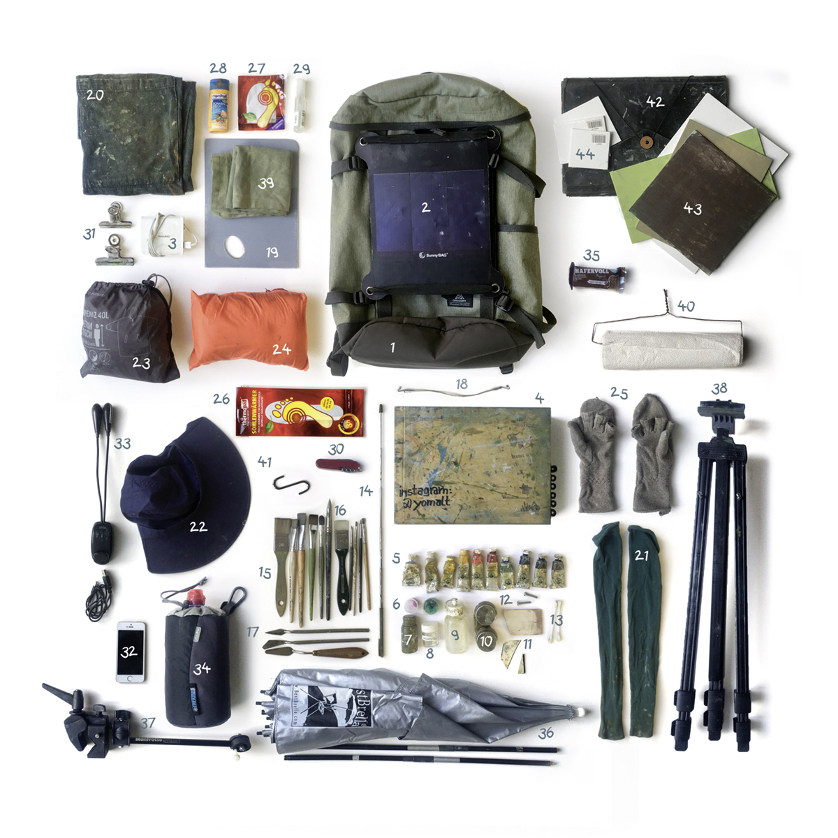
For anyone who wants to know what I take with me outside, I’ll show you the contents of my painting backpack here. I’ve optimized my equipment over the years and prepared for all eventualities – that doesn’t mean you have to get it all before your first painting trip, of course!
Although I try to limit myself to the essentials, it still adds up to quite a lot. Without the water, it weighs around 7 kilos on average – so it’s important to find a good rucksack with straps that don’t cut in. Mine also has straps on the side with which I can attach the easel and the umbrella, so I have my hands free. I added the solar panel myself. It’s super handy to be able to charge your cell phone or connect the LED light to the battery even when you’re far away from the nearest power socket. (The page references in the list refer to my book, in which I go into much more detail).

Painting boards
There are many surfaces you can paint on. I personally only use painting boards or painting cardboard. They are not expensive, they are available in all formats and they are easy to cut with a cutter. They are available in cardboard or MDF, laminated with different canvases (white or natural) or unlaminated without texture.
I now almost exclusively use painting boards without texture, as I can wipe or scrape the paint off their smooth surface completely if necessary without it getting stuck in the pores of the canvas.
Almost all painting boards on the market are already primed and ready to paint, so you can start painting on them straight away or you can prime them yourself as required (also in color). As the primer of many painting panels (usually a kind of gesso) “soaks in” the first coat of paint too much for me personally and I therefore need too much paint, I prime them with a less absorbent primer: I can recommend the oil primer from Gamblin. If I don’t have time to let this primer dry for a week, I use normal acrylic paint instead.
I never take only colored primed painting boards outside, in case the color does not match the motif and I would otherwise have to “paint” against it all the time – I always have white ones with me.
Don’t take on too large a format, especially at the beginning: you only have about 1-2 hours to finish your painting. Approximately DinA 4 is a good guide as an upper limit. This will also make it easier for you to transport the painting.

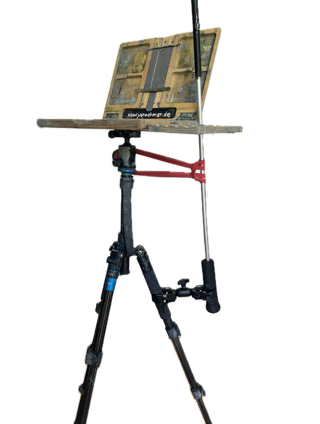
Easels and pochade boxes – an overview
I’ll show you various ways to set up your “plein air studio” here. If you don’t want to make any major purchases at first, it’s perfectly fine to find somewhere to sit, put a clipboard with your painting on your lap and hold the mixing palette in your hand. The disadvantage is that you’ll get pretty cramped this way, you’ll never have your hands free and you’ll always need a seat. I would also highly recommend that you paint standing up: You have a higher viewing angle and can see the shadows on the floor better. Many motifs are also not so suitable for the frog perspective that you adopt when sitting down. Above all, however, you should paint standing up, as this is the only way you will be mobile enough to take a few steps back. Only when you look at your painting from a distance can you better assess the big picture and compare it with what you see in front of you.
To paint standing up, you need an easel: these are available in a wide variety of versions and in all price ranges. I’ll show you a small selection here. My tip: When painting, it is a great help to be able to attach the palette to the easel so that you have your hands free!


- Field easel made of aluminum or wood – when buying, note whether you have the option of attaching your painting at eye level.
- Here I have hooked a self-made folding pallet to the front of the field easel.
- This is a rather elaborately built pochade box in which I also transport all the materials and have them at working height (you can find instructions in my book and on my blog).
- Deluxe version: a professional pochade box. Most of these boxes can only be ordered from England or the USA. The one shown here is from Newwaveart and is called u.go. It is mounted on a photo tripod.
You can even get them in Germany: from Peters Art Shop and Kremer Pigmente - This very light box with integrated panel transport and side sliders was built in Greece, you can get it at Papa Pavlo Art Tools (and with this link you will get even 15% discount)
- I designed this box exclusively for my Domestika online course: the course includes a PDF download with detailed instructions and manufacturer links for all the materials used.
It is modeled after the u.go box but has storage space under the palette for (small) tubes and brushes. >Video:
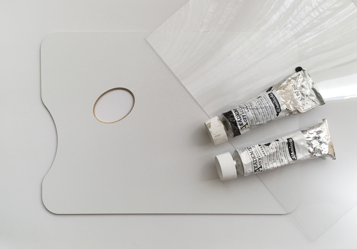
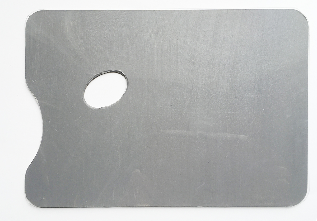
Mixing pallet
My mixing paletteconsists of a ready-bought white palette that I have primed with a neutral medium gray. This makes it easier to judge the brightness of the mixed color. On white, even very light tones often appear too dark, and on a wooden palette, the warm wood color distorts the color temperatures.
I also put a thin sheet of Plexiglas on top – this way the gray always stays gray and cleaning is much easier.
The (reduced) color palette –
which colors you really need
If you paint in your studio, you probably have a myriad of different colors to choose from. But you certainly don’t want to lug them all around with you when you move your studio outside. So it’s all about making a smart choice. In order to be able to mix as many colors as possible without any problems, I did a lot of research and trial and error, and I’ll show you the results here:
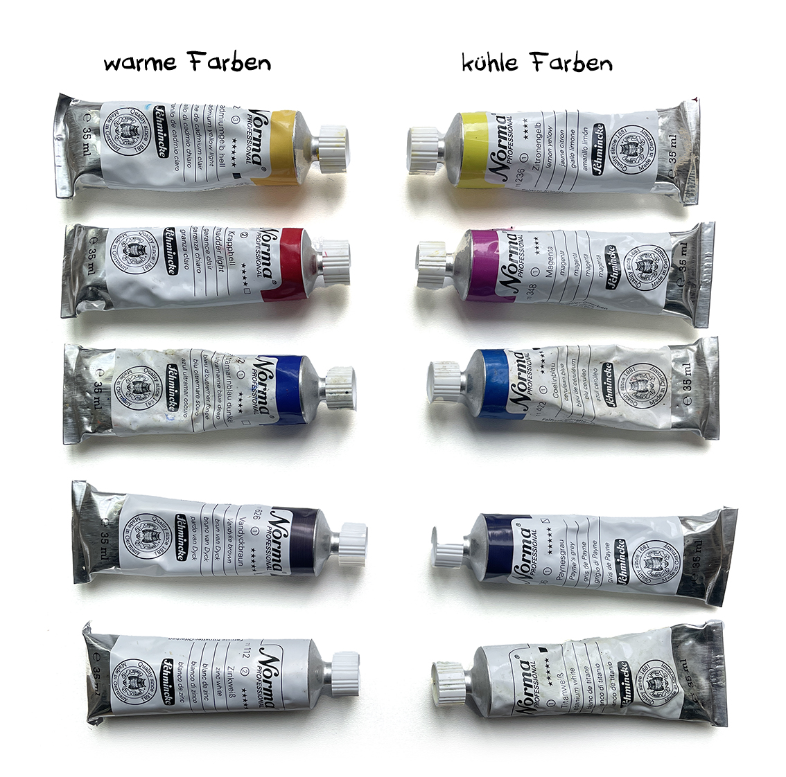
I use all three primary colors in a warm and cold variant. Warm here means yellow or red-tinged, or cold: blue-tinged in relation(!) to the comparison color.
This results in a “double” color wheel:
I can use it to mix almost all colors as brightly as possible – regardless of whether they are warm or cool tones.
A warm yellow and a warm red can be used to mix wonderfully bright orange tones.
The cool red mixed with the warm blue, which has a red tint, produces beautiful violet tones.
The lemony yellow mixed with the cool blue makes the green tones shine beautifully.
The saturation can then be easily broken with the respective complimentary color.
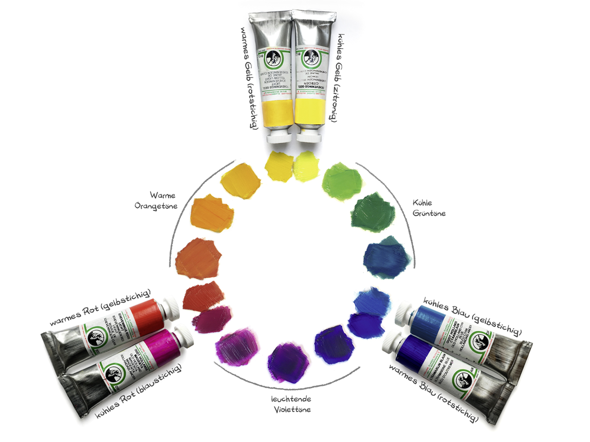
I then use two different shades of white for brightening: zinc white and titanium white. Both whites have different properties, which is why both are important. I don’t use black at all, because it creates dead black holes in the painting on its own, and it doesn’t really do any color any good when mixed. It makes them darker, but it always makes them dirty. That’s why I have two very dark shades on my palette instead of black: Van Dyck brown and Paynes gray. I chose these two shades using the same logic as my primary colors: The brown is a warmer, more yellow-toned shade, while the gray is blue-toned and therefore cooler. As a result, these two tones also complement each other.
In total, I have ten tubes that I always have with me. (I have kept the color names as general as possible so that they are transferable to all brands).
- Zinc white (neutral, semi-opaque)
- Titanium white (cold, opaque)
- Lemon yellow (cold)
- Cadmium yellow light, Naples or Indian yellow (warm)
- Vermilion, cadmium or madder light (warm)
- Magenta or ruby red (cold)
- Cyan or cerulean blue (cold)
- Ultramarine or cobalt blue (warm)
- Van Dyck brown (warm)
- Paynes gray (cold)
The painting shows my choice of paints from Schmincke (Norma):
I also work with these paints in my workshops and can highly recommend them to everyone as basic oil paint equipment!
I describe exactly how I came up with this selection and everything else you need to know about blending in my book, explain it in my Domestika online course and teach it in my workshops.
If you paint with acrylic or gouache, this selected palette will also serve you well. Please note, however, that these water-soluble paints dry very quickly on the palette outdoors – sometimes even while mixing! I strongly recommend that you test the effect of wind and sun outdoors before you start your first plein air painting!
Ask your specialist retailer about options such as drying retarders, water atomizers or moist pallets.
Paint transport
Pillbox
If I know that I’m going to be painting more often in the near future, I fill my chosen paints into small airtight jars to save weight. I use pill boxes for this (these are from MUJI), in which the oil paints stay moist for up to 2 weeks.
Depending on the landscape, I treat myself to a few extra colors if they are particularly common there.
UDATE:
The tins are practical, but unfortunately not easy to clean. That’s why I now use a color square:


Color angle
I had seen this super good patent from a student and immediately copied it:
I portion my oil paints onto an angle (in this case self-made from plastic, but there are also angles made from aluminum in DIY stores). It fits exactly into a small brush tube (35mm Ø). The tube is available here, I made it as airtight as possible (with a “sealing ring” made of adhesive tape). At the bottom is a natural sponge with a few drops of clove oil, which is an antioxidant and prevents the oil paints from oxidizing/hardening. They actually stay moist in the tube for several weeks. Stored in the fridge for even longer …
I attach the bracket to my pochade box with a magnet (because of the wind in Brittany).
With both the pill boxes and this color angle, I not only save weight, but also the tiresome task of loading palettes with 10x tube open/tube closed before I can start painting.

Painting medium (for oil paints)
There are an incredible number of painting mediums: they all change the properties of the oil paint. They make it dry faster or slower, dilute it, make it smoother or more pasty. Apart from the oils, they are all (sometimes more, sometimes less) harmful to health and most of them smell very strongly.
I only use thinner (for the very first coat of paint, which dries quickly and can be painted over, and to clean the brush during painting) and oil (very rarely and then only very little, to make the paint smoother if necessary).
Nothing else.
The oil is purified linseed oil or linseed oil, which I mix with thinner in a ratio of 5:1. My preferred thinner is the odorless Gamsol from Gamblin. The thinner from Zest-it is also very good . An interesting new discovery (for me) is the Spikeoil from Chelsea Classicalbut this smells very strongly of lavender.
As the first two thinners mentioned are not currently available in Germany, I recommend the alternative Diluent N from Schmincke as an alternative. It is odorless and above all aromatic-free, so it is not quite as harmful to health as other thinners.
If you can’t get any, you can also use balsamic turpentine oil if necessary. However, this smells very strong, which I find unpleasant even outdoors.
I also tested the odorless Green for Oil thinner from Sennelier: for me personally, it dries too slowly in the first paint application.
The following low-aromatic thinners also sound interesting, but I have not (yet) tested them myself:
Izosol from Kama Pigment
Shellsot T from Jackson’s
If possible, do not use white spirit, turpentine or similar. These substances are very harmful to health! Even turpentine, which is almost odorless, is very harmful to health – which in the worst case scenario you won’t even notice due to the lack of smell!
Incidentally, I keep the remains of my thinner in a screw-top jar and use it again and again. Under no circumstances should it be poured down the sink!

Brush and spatula
These are the brushes I show in the book. They vary from time to time, but basically they are never particularly expensive brushes, rather inexpensive hobby brushes. At first, I didn’t want to buy expensive brushes because I don’t always clean my brushes immediately after painting—I was afraid of ruining them. I quickly realized that my inexpensive brushes do everything they’re supposed to do – and they last an amazingly long time! I only use synthetic brushes. My favorite shape is flat brushes with long, soft “hairs” that form a sharp edge at the top. This allows me to create fine lines when I hold them vertically.
I always try to paint with the largest possible brush: when painting plein air, it’s very important to be quick before the light changes too much. And this is only possible if I apply the paint over as large an area as possible, not too small. I only rarely use finer brushes (under 10 mm) for a few details in the painting.
I always have palette knives with me, which I use for mixing and also for applying paint. Silicone “shapers” are very helpful for removing paint from the canvas.
I also carve these shapers myself out of rubber in various sizes—you can also cut them out of silicone dough scrapers.

+Update+
It was only after my book was already finished that I discovered the wide flat brushes from Panart Global (Echo Synthetic). They also have synthetic bristles, but are of much higher quality than my previous brushes.
++Updated update++
I was so impressed with Panart brushes that I ordered more: now I paint almost exclusively with their brushes. Here are all the brushes I currently use: in addition to those linked above, there are the School N Hobby brushes for watercolors and also the Angular brushes.
The only fine brush I use is their Script Liner.
My favorite palette knife is also from Panart.
In Germany, they are all available at Peters Art Shop—my favorite store for art supplies.
(This sounds like advertising, but I’m not being paid for it.)
At the very bottom is my DIY tool: the “Stips.”
The hard rubber I cut it from is intended for drywall construction: Parajito Werkzeuge

Also not in my book are the brush cleaners made by Chelsea Classical and Sennelier – Green for Oils. I’m currently testing them at my leisure and will report back*… But I can reveal this much: both clean my brushes faster than liquid brush soap (as described in the book) and both dry out the brushes less than if I simply clean them with Gamsol.
As with Gamsol, the ‘ dirt ’ in the used liquid settles at the bottom after a while: if I then carefully pour the clearer liquid from the top into a clean screw-top jar, I can use it again and again. This is sustainable and good for the environment.
* I have now used both for a while and find the one from Sennelier slightly better. Above all, it smells of almost nothing (similar to the Gamsol), the cleaner from Chelsea Classical smells quite strong (lemony or lavendery chemical, depending on the variety).

Finally: how do I transport my wet painting?
Many people are reluctant to paint outside with oil paints because the paintings dry so slowly. One of the questions I am asked most often is: “Is it even possible to transport such wet paintings without smearing the entire surface?” Sure, you can! Of course, the painting has to be covered to get it home in one piece. The trick is to ensure that the cover and the fresh paint do not touch over the entire surface. Such spacers can be made with thumbtacks, for example . You can either put them on a piece of cardboard and place it on the painting before putting it in a folder, or you can attach the pins directly to the inside of the folder cover. Of course, there shouldn’t be too much pressure on the cover, but not too little either, because it shouldn’t slip in the folder either can. From time to time it happens that in the fresh painting but then you can see very small marks (or scratches from slipping): But I can simply cover them up again with the oil paint while it’s still wet.
UPDATE:
As I am almost always on the road with my bike and only a rucksack, I no longer use such “Fakir folders”: there have been too many accidents due to too much pressure on the folder lid.

There is a safer way to protect the wet surface of the oil painting during transportation: the “sandwich”. Here, 2 equally sized painting panels are placed on top of each other with a spacer and fixed with rubber or masking tape so that they cannot slip. I use matchsticks as spacers for small panels and 4×4 mm squared timber (2 cm long) for larger ones. This package is then placed in a folder. Of course, you shouldn’t press on them too hard, otherwise they will touch in the middle.
The pressure marks in the wet paint in the corners of the painting may then have to be tightened at home with a brush.
With this patent you always need at least 2 painting boards of the same size, but if necessary you can also build stacks of 3 (or even higher towers!) from them.

And how do I transport several wet oil paintings or even a whole week’s worth of paintings?
That’s a bit of handicraft work:
To do this, I have mounted sliding strips made of wooden sliding strips in a folder or in a drawing case: As spacers 4×4 mm squared timber (balsa wood strips) are used here. Sometimes a little paint smudges when sliding in and out, but because it is still damp at home, you can simply “wipe it off” again.
The half roundwoods I found for my drawing case are great: they minimize the contact points of the painting and the rail – so there is hardly any smudging of paint on the sides. The best way to save space is to always fit two paintings back to back in a gap.
I have built such folders and cases for different picture formats.


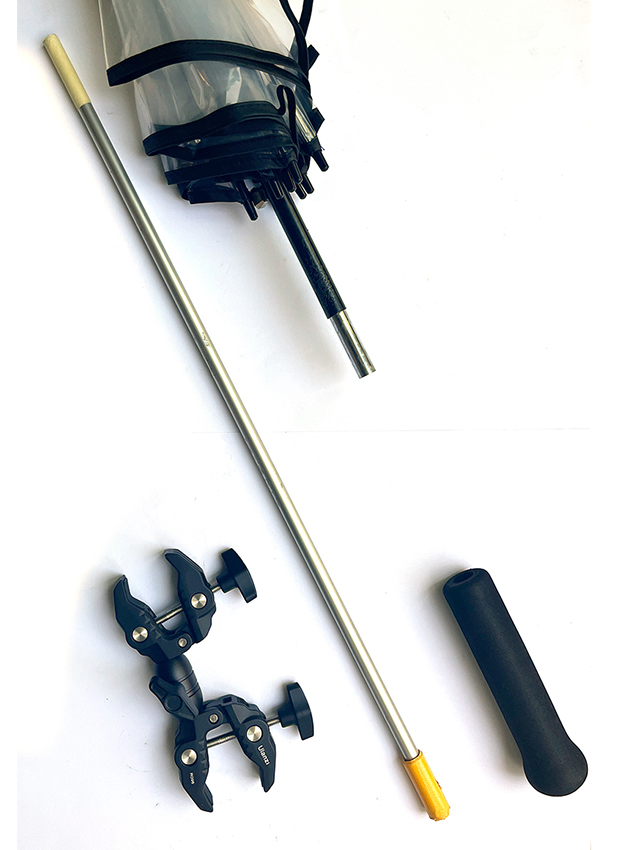
Optional: Umbrella
If you go out to paint more often, an umbrella will also be very practical (but is not necessarily part of the basic equipment).
An umbrella will help you if you have the sun behind you or if it is shining on the side of your palette: on the one hand, the sun is very dazzling on the canvas, and on the other hand, you will be disappointed when you look at a painting painted in the sun at home. Without the sun, it will be much darker and won’t shine the way you intended when you painted it.
Against the sun I have a gray umbrella – the umbrella from Bestbrella, including the Manfrotto mount.
I show it in my material above (and in the book), but unfortunately it no longer exists.
In the rain, the mur was too dark anyway: as an alternative, I bought a normal umbrella (in the painting a large transparent umbrella for golf), took off the handle and bought an aluminum extension pole at the hardware store that fits exactly into the umbrella pole. I then mounted the handle on this rod and fastened it with a clip (which I unfortunately only found here ).
In my workshops, a few people used umbrella holders that are actually intended for baby carriages or rollators.
If you buy an opaque umbrella against the sun (and rain): Look for a neutral color (medium grey) , so you can judge the colors when painting without a color cast and if possible take one with “wind slits”. Either way: if it’s really windy you can never use the umbrella (no matter which one), it will take off immediately.

If you want to know more: I have described all this and much more in my plein air book.
Do you have any questions about my material?
Please leave a comment so that I can reply for everyone to see.
Please send me the workshop dates and brand of brushes thanks ! Clark
Hi Clark:
Just have a look on my workshop site to see the dates:
https://yoruehmer.de/home/workshops
And on my pleinair equipment site I show all my brushes (with brand) here:
https://yoruehmer.de/home/en/pleinair-equipment/#Pinsel